Without clicks and conversions, a good-looking website is virtually useless.
Even if your client’s website copy is phenomenal, it needs to be paired with high-converting UX/UI techniques to ensure users see the value of the services or products they are viewing.
There are several UX/UI design trends and other best practices you can use to help improve conversion rates for your clients. Keep reading to learn some of the best design techniques currently being done by other HubSpot Partners.
Redesign your above-the-fold area
The ‘Above the Fold’ area of your client’s website is what users see first and where they get the bulk of information before committing to a CTA. One of the biggest trends right now to help conversions is to pay more attention to this area's aesthetics.
A good practice is to include necessary information about the business, such as your client’s Value Proposition, what problems the end user faces, and how your client solves these problems. You'll have to analyze the type of users visiting the site and how much information they're willing to absorb because every site is going to be different based on industry and the types of users visiting.
A title and a paragraph aren't always enough for a visitor if the user needs to learn more. What's most important is to provide everything needed before placing the CTA, even if the info goes below the fold. As Neil Patel notes, placing the CTA at the bottom is always going to out-convert placing it near the top.
If you don't want to provide multiple paragraphs, offer some links the user can click on to get more info before committing to a call to action.
Work on your load speed

Don't get too busy here, even if it's tempting to wow users with animations and other design magic. You can do a lot with less, especially if you have compelling content in the above-fold area.
Test to see how long it takes for the site to load on a mobile device. If it goes beyond three seconds, Google reminds 53% of visits on average are going to abandon the site.
Creating a balance between text, visuals, and links
The real magic of UX on a website is a delicate balance with the text you use, graphics, and links to outside sources. This is an art form on its own.
A good technique for text is to always include subtitles before you present a long explanation about something. Doing this helps make the text look less overwhelming. Long paragraphs are big turn-offs in UX nowadays, leading most users to skip over vital information.
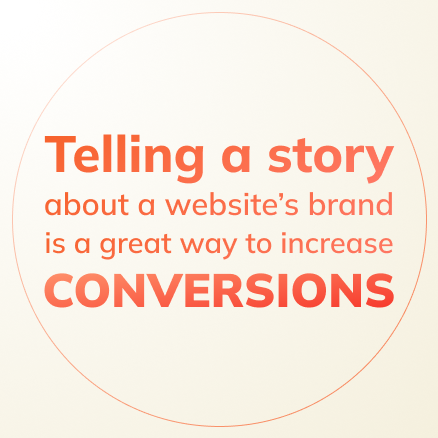
Mix this up with visuals along the way to bring a sense of storytelling. Telling a story about a website's brand is the new trend that helps increase conversions, including adding links when necessary to back up credentials.
Just keep in mind that you don't want too many distracting links or images either. A user may click on those and become too distracted from ever getting to the CTA.
When you're onboarding clients and introducing them to HubSpot, that is only the beginning of a profitable business relationship. There are so many ongoing opportunities you can explore with your clients to ensure they grow and your agency grows too.
If your team is strapped for resources or simply wants to focus on strategy and growth, consider having us on your side as a white-label partner to handle all the execution work.
We’re a silent partner, for HubSpot Partners. Reach out to our team and learn how other partners leverage us to profitably scale.
Use of the mere exposure effect

So rather than reinventing the wheel every time a website is created, your team can include these familiar patterns. Examples like placing the logo in the top left corner or using the ‘hamburger’ icon as the menu, will help users easily navigate the site.
Keeping certain elements consistent with what users already know has many advantages. Think of a design that is simple so users can easily find the information they need to take the next step in their journey.
Make your buttons and links stand out
Your CTA buttons and links should always be made to stand out and follow a consistent style guide. Assigning and sticking to a style for primary, secondary, and simple links will make the user stick around interacting on the site.
A lot of branding can go into these, including using a particular graphic or color representing the business. It personalizes the links and buttons as a way to keep engaging and learning more information.
Try to avoid becoming too over-the-top in how you design these. The key is to make them stand out and consistent to help the user take action.
Balancing forms and information

For structure, HubSpot notes that simplicity is the key, including using only one column if you can. Arranging form fields from easiest to hardest is another good way to keep a user engaged.
Other useful techniques are inline form field validation, a clear title, and auto-fill browsers as just a few.
Related Post